You have probably seen them thousands of times without ever stopping to think about them.
A simple figure with a triangle-shaped dress.
A second figure without one.
Sometimes there is a wheelchair symbol nearby. Sometimes there are letters, arrows, or small icons showing a baby-changing station.
Restroom signs are so familiar that most people barely notice them.
But those seemingly simple shapes were not chosen at random.
Behind restroom signs is a fascinating combination of visual communication, cultural convention, accessibility, and design psychology. Their main purpose is actually quite practical: to help people identify the correct facility quickly, even when they speak different languages or cannot read the surrounding text.
And once you understand how these symbols developed, you'll probably start noticing details in restroom signs everywhere.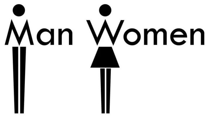
Why Use Pictures Instead of Words?
Imagine walking through an unfamiliar airport.
You don't speak the local language.
You urgently need to find a restroom.
If every sign contained only words, you would first need to understand the language before knowing where to go.
A pictogram solves that problem.
Instead of relying entirely on written language, a pictogram communicates information visually. A person can recognize the general meaning almost instantly.
This is especially useful in places with large numbers of international visitors, including airports, train stations, shopping centers, stadiums, hospitals, and hotels.
The goal is speed and recognition.
A good public sign should ideally be understandable from a distance and recognizable without requiring people to stop and read a paragraph.
That is why restroom signs tend to use extremely simple shapes.
The Famous “Man” and “Woman” Symbols
The most familiar restroom symbols are the contrasting human figures traditionally associated with men's and women's facilities.
The symbols are often simplified into a geometric human body.
The figure traditionally used for women is commonly shown with a triangular shape resembling a skirt or dress, while the other figure is represented by a more rectangular body shape.
These aren't anatomical drawings.
They are conventional pictograms.
Their meaning comes largely from widespread public use.
In other words, there is nothing inherently “male” about a rectangle or inherently “female” about a triangle. Society has learned to associate those particular combinations of shapes with particular restroom categories.
Once a symbol becomes widely used, people can recognize it almost automatically.
That's the power of visual convention.
The Symbols Are Designed to Be Understood Quickly
One of the most interesting things about restroom signage is how little information it actually needs to communicate.
A designer does not need to create a realistic human figure.
In fact, too much detail could make the symbol harder to recognize.
Instead, designers usually reduce the figure to its most recognizable visual characteristics.
The head becomes a circle.
The body becomes a few geometric shapes.
The limbs become simple lines or blocks.
The result is almost icon-like.
This principle is used throughout public signage.
Think about symbols for exits, elevators, stairs, telephones, food areas, or information desks.
The fewer unnecessary details a symbol contains, the faster people can understand it.
Restroom Signs Are Part of a Larger Visual Language
Restroom symbols don't exist in isolation.
They are part of a much broader international system of visual communication.
Modern public spaces depend heavily on pictograms because people constantly cross linguistic and cultural boundaries.
An airport in one country may have travelers from dozens of nations walking through it every day.
The designers therefore need signs that are easy to recognize without requiring translation.
This is why international-style pictograms have become so important.
You may not know the local word for “restroom,” but a familiar symbol can still tell you where to go.
Why Are They Often Red, Blue, Black, or White?
You may also have noticed that restroom signs appear in different colors depending on the location.
There is no single universal color that every restroom sign must use.
What matters more is contrast and consistency within the building or sign system.
A symbol needs to stand out clearly from its background.
Color can also be used to separate categories or improve visibility.
Some locations use different colors for different facilities. Others use the same color for every sign and rely entirely on the pictogram.
In many cases, the shape itself carries more meaning than the color.
This is important because color perception varies between people, including individuals with color-vision deficiencies.
A well-designed sign should therefore not rely on color alone to communicate essential information.
Why Restroom Signs Are So Simple
There is actually a practical reason these signs look almost childish compared with detailed illustrations.
Complexity slows recognition.
Imagine trying to identify a restroom from a highly realistic drawing of a person wearing clothing, standing in a room.
You would need to process far more visual information.
A simplified icon can be recognized almost instantly.
This principle is especially useful when people are moving quickly.
In an airport corridor, for example, someone may only have a second or two to notice a sign.
The symbol needs to work at a glance.
That's why restroom pictograms often use strong outlines, simple geometry, and high contrast.
What About Wheelchair Symbols?
Another symbol commonly found near restrooms is the familiar wheelchair icon.
This one serves a different purpose.
Rather than identifying a gender category, it indicates accessibility.
An accessible restroom may include features such as appropriate clear floor space, grab bars, accessible fixtures, and other design elements depending on local building standards.
The wheelchair symbol therefore helps people identify facilities designed with accessibility in mind.
Importantly, the symbol does not mean that only wheelchair users are allowed to enter.
Accessible facilities exist to accommodate people with a wide range of mobility needs.
This is one reason accessibility signage is an important part of inclusive public design.
Why Do Some Restrooms Use Different Symbols Today?
As ideas about gender, inclusion, and accessibility have evolved, restroom signage has evolved too.
Some places continue using the traditional male/female pictograms.
Others use words such as “Men” and “Women.”
Some facilities use gender-neutral symbols or labels.
Others provide individual or all-gender restrooms.
The choice depends on factors such as local regulations, cultural expectations, building design, and the needs of the people using the facility.
This is a reminder that symbols are not permanent truths.
They are systems created by people.
Their meanings can change as society changes.
The Importance of Universal Design
Restroom signs also connect to a broader concept called universal design.
Universal design aims to make spaces understandable and usable by as many people as possible without requiring special adaptation.
Clear signage is a major part of that philosophy.
A well-designed restroom sign should ideally be:
Easy to see.
Easy to understand.
Easy to locate.
Consistent with other signs nearby.
Readable from an appropriate distance.
And accessible to people with different visual, cognitive, or language needs.
This might sound simple, but designing effective public signage actually requires considerable thought.
Braille and Tactile Information Matter Too
Some restroom signs include raised letters, tactile symbols, or Braille.
These features are especially important for people who are blind or have limited vision.
A person should not have to rely entirely on seeing a pictogram in order to navigate a public building.
Tactile signage can help someone identify a restroom by touch.
This illustrates an important principle of accessibility:
Good signage should not depend on only one sense.
Visual information can be supplemented with tactile information, and sometimes auditory information is used elsewhere in building navigation systems.
Why You Sometimes See a Triangle or Dress
The triangular “skirt” shape has become one of the most recognizable elements of conventional women's restroom signage.
But it's worth remembering that this is simply a cultural symbol.
Women obviously do not always wear dresses or skirts.
Likewise, the absence of a triangle does not literally represent every possible appearance of a man.
The symbols are intentionally simplified.
Their job isn't to describe real people accurately.
Their job is to create a quick visual distinction between categories.
This is similar to many other icons that sacrifice realism in favor of instant recognition.
The Signs Work Because We Learn Them
A fascinating part of symbol design is that people don't necessarily understand every icon instinctively.
Many symbols become intuitive because we repeatedly encounter them.
As children, we gradually learn that a particular shape means restroom, another means emergency exit, another indicates stairs, and another means no smoking.
Over time, these associations become automatic.
That's why you may recognize a restroom sign without consciously thinking through what each shape represents.
Your brain has already learned the visual language.
Why Consistency Matters So Much
Imagine walking into a building where every restroom uses a completely different symbol.
One door shows a detailed drawing.
Another uses a word.
A third uses an abstract geometric symbol you've never seen before.
It would take much longer to figure out where you belong.
Consistency solves that problem.
When the same or similar conventions are used across many buildings and countries, people can navigate unfamiliar environments more confidently.
This is particularly important in high-pressure situations.
A person doesn't want to spend several minutes decoding a sign when they are rushing to find a restroom.
The best signage almost disappears into the background because people understand it without thinking.
Restroom Signs Are More Than Decoration
At first glance, a restroom sign may look like nothing more than a label on a door.
But it actually performs several functions simultaneously.
It communicates location.
It establishes a category.
It reduces language barriers.
It supports accessibility.
It helps people navigate unfamiliar spaces.
And it does all of that using only a handful of simple shapes.
That's remarkable when you think about it.
A tiny icon can communicate information to millions of people without saying a single word.
Why You Notice Them Everywhere Once You Know the Story
After learning how restroom signs work, you may start seeing them differently.
You'll notice whether a building uses pictograms or words.
You'll notice whether accessible facilities are clearly marked.
You'll notice how much contrast the signs have.
You'll notice whether symbols are consistent throughout the building.
You may even notice that two countries can use similar ideas while representing them slightly differently.
What once looked like an unimportant icon suddenly becomes part of a larger story about how humans communicate.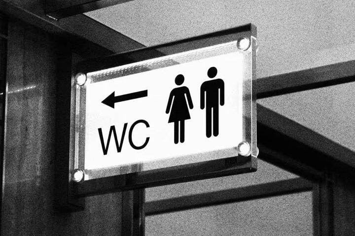
The Bigger Lesson Behind These Simple Symbols
Restroom signs are a great example of a principle that appears throughout design:
The best communication is often the simplest.
You don't need a sentence when a symbol will do.
You don't need a detailed illustration when a few geometric shapes are enough.
You don't need to speak the same language when a visual convention can communicate the idea instantly.
That simplicity is deliberate.
Behind every familiar icon is a series of decisions about recognition, culture, accessibility, visibility, and human behavior.
So the next time you walk past a restroom sign, take a closer look.
That little figure on the door isn't random.
It represents a visual language that has been developed and refined so that millions of people can understand a basic message almost instantly.
And perhaps that's what makes these signs so interesting.
They say a lot without saying anything at all.