Recently, viral psychological visual tests claiming that "the first three colors you see reveal the hidden burden you carry" have captivated millions online. While these quizzes are designed primarily for self-reflection rather than clinical diagnosis, they tap into a very real psychological phenomenon: how our minds use visual cues to process complex emotions.
The Fascinating Link Between Color and Emotion
Color psychology is a well-established field that explores how different hues evoke specific emotional and physiological responses in humans. For centuries, artists, marketers, and therapists have utilized colors to influence mood, energy levels, and focus. Red can spark urgency or passion, blue often instills calmness, and gray or dark shades frequently symbolize fatigue or emotional heaviness.
When presented with a complex visual pattern and asked to immediately pick out the first three colors that catch your eye, your brain doesn't choose at random. Instead, your subconscious mind—heavily influenced by your current mental state and emotional needs—instantly gravitates toward hues that resonate with what you are experiencing beneath the surface.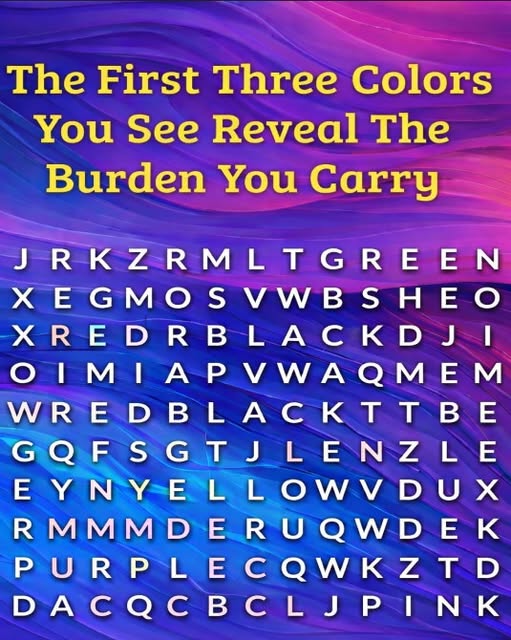
What Your Color Choices Might Signify
While interpretations vary across different interactive quizzes, color association tests generally link certain emotional themes to specific visual reactions:
-
Dark Tones (Black, Charcoal, Dark Gray): Often chosen by individuals who are currently wrestling with mental exhaustion, overwork, or unspoken grief. It reflects a heavy burden of responsibilities that feel difficult to escape.
-
Warm Tones (Red, Orange, Bright Yellow): Frequently spotted by those dealing with high-stress environments, pent-up frustration, or intense ambition. It highlights the internal friction of trying to balance drive with burnout.
-
Cool Tones (Blue, Green, Teal): Drawn to by people seeking emotional healing, peace, or closure. It often points to a quiet longing for balance after a period of relational or personal turbulence.
Why Self-Reflection Matters for Mental Wellness
Quizzes and psychological games are rarely scientifically definitive, but they serve a valuable, practical purpose: they encourage us to hit pause. In a culture that constantly demands productivity, people rarely take a moment to ask themselves, "How am I actually feeling right now?" Utilizing a simple visual prompt as a mirror for your internal state provides a gentle entry point into mindfulness, prompting you to address stress before it becomes overwhelming.
The Bottom Line
Whether the first three colors you see accurately pinpoint your exact emotional burden or simply serve as a fun, introspective pastime, taking time to check in with your mental health is always worthwhile. Recognizing the invisible weights you carry is the very first step toward lightening the load and finding your way back to balance.