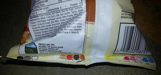
Have you ever noticed a row of small colored circles, squares, or blocks printed along the edge of a food package?
They might appear on a bag of chips, a box of cereal, a package of cookies, a frozen-food carton, or even the packaging for bread and other everyday products.
You may have wondered:
Are those colors telling me something about the ingredients?
Do they indicate how healthy the food is? Do they reveal artificial dyes? Could they tell you whether a product contains preservatives or other additives?
There are plenty of viral claims online suggesting that these little colored marks contain a hidden code for consumers.
In reality, the explanation is usually much less mysterious—but also more interesting.
These marks are generally related to the printing and packaging process, rather than serving as a secret nutritional or ingredient code.
Understanding what they are can help you avoid one of the most common mistakes people make when interpreting food packaging: assuming that every symbol or colored mark is intended as information for the consumer.

What Are Those Colored Circles or Squares?
The colored marks you see on some packages are often called printer's marks, color control patches, color bars, or registration marks, depending on their exact form and purpose.
They are primarily used during the manufacturing and printing process.
Food packaging is frequently printed using several separate ink colors. In conventional commercial printing, a common process uses the four basic process colors:
-
Cyan
-
Magenta
-
Yellow
-
Black
These are often abbreviated as CMYK.
By combining different amounts of these inks, printers can reproduce a huge range of colors and images.
But printing isn't simply a matter of putting ink on plastic, paper, or cardboard.
Manufacturers need to make sure that the colors are being applied consistently and that different layers of the printing process line up correctly.
That's where those small colored marks can become useful.
Why Does a Printer Need Color Control Marks?
Imagine a food package showing a photograph of strawberries.
The strawberries need to look red.
The leaves need to look green.
The background needs to have the correct shade.
The text and branding need to remain sharp.
If one of the printing colors is slightly misaligned or applied incorrectly, the final package may look noticeably different from the intended design.
A printing press therefore needs ways to monitor the process.
Small color patches can provide a reference point.
During production, printing technicians and quality-control systems can examine these marks to determine whether the ink density and color reproduction are within acceptable limits.
In other words, those little circles aren't necessarily there to communicate something to you.
They may be there to communicate something to the printing equipment or the people operating it.
The CMYK Connection
To understand these marks, it helps to understand how commercial printing works.
Many printed materials use a four-color process known as CMYK.
The letters stand for:
C — Cyan
A blue-green color.
M — Magenta
A pinkish-red color.
Y — Yellow
The familiar yellow pigment.
K — Black
Black is represented by K, traditionally associated with the key printing plate.
By layering these inks in different combinations and densities, printers can create the wide variety of colors used in packaging.
For example, what looks like a single solid orange area on a package may actually be produced by carefully combining multiple printing inks.
The small colored patches help printers monitor these components.
Are the Colors a Secret Code for Ingredients?
This is one of the most common claims about these marks.
You may encounter posts claiming that:
-
Red means dangerous ingredients.
-
Blue means artificial ingredients.
-
Green means natural ingredients.
-
Yellow means preservatives.
-
Black means poor-quality ingredients.
These claims can sound convincing because the marks appear deliberately placed on the packaging.
But the color of a printer's control mark does not generally provide a reliable code for determining whether a food contains particular ingredients.
If you want to know what's inside a packaged food, the appropriate place to look is the ingredient list and nutrition information, not a row of colored printing patches.
This is an important distinction because food packaging contains many different types of visual elements.
Some are designed for consumers.
Others are designed for manufacturing.
Not every mark has a nutritional meaning.
Why Do Some Packages Have Them While Others Don't?
You may notice that one package has several colored circles while another package from the same store has none.
That doesn't necessarily mean anything is wrong with either product.
Packaging varies according to:
-
Printing technology
-
Packaging material
-
Printer
-
Manufacturer
-
Product design
-
Number of ink colors used
-
Production requirements
-
Quality-control systems
Some packaging designs may place color-control elements in areas that consumers rarely notice.
Others may use different systems that aren't visually obvious.
Modern printing technology can also automate much of the quality-control process.
As a result, there is no universal requirement that every food package display the same type of colored marks.
What Do Color Bars Actually Help Printers Check?
Depending on the printing process, control patches can be used to evaluate several aspects of print quality.
Color density
Printers need the amount of ink applied to remain within an appropriate range.
Too little ink can make colors look weak or washed out.
Too much can make them appear overly dark or cause other printing problems.
Color consistency
A brand may want its logo to look the same from one production run to another.
Small variations can become noticeable when packaging is produced in enormous quantities.
Registration
Registration refers to how accurately different printing layers align with one another.
If the layers aren't properly aligned, images and text can appear blurry or show unwanted colored edges.
Ink coverage
Control patches can also help evaluate how ink is being transferred across the printed material.
These measurements are especially important in high-speed commercial printing.
Why Is Accurate Color So Important for Food Brands?
Color isn't merely decorative.
For large food companies, packaging is part of their brand identity.
Think about a familiar cereal box or snack package.
Consumers may recognize it from a distance based on:
-
Color
-
Logo
-
Typography
-
Images
-
Shapes
-
Overall design
If the colors change dramatically between batches, consumers may perceive the product as different—even if the food inside is identical.
This is particularly important for companies with recognizable brand colors.
A slightly different shade of red or blue might not matter to a casual observer, but it can matter significantly to a professional packaging team.
What About Small Black Marks or Symbols?
Not every small mark on packaging is a color-control patch.
Some tiny symbols may be related to:
-
Registration
-
Cutting
-
Folding
-
Sealing
-
Positioning
-
Barcode production
-
Packaging machinery
-
Quality control
Flexible packaging, such as plastic bags and wrappers, often needs to be precisely positioned during manufacturing.
A machine may need to know exactly where to cut or seal the material.
Small marks can help automated equipment identify the correct position.
So when you see a tiny black square or colored mark near the edge of a package, its purpose could be completely different from the colored patches you see elsewhere.

What Is a Registration Mark?
A registration mark helps ensure that different elements of a printed design line up correctly.
Imagine a package that is printed using several different color layers.
If the cyan layer is shifted slightly to the left while the magenta layer is shifted slightly to the right, the final image may look distorted.
Registration marks give printing equipment and quality-control systems reference points for alignment.
When everything is correctly registered, the different components line up as intended.
When they're not, technicians can make adjustments.
This is one reason some tiny marks can appear near the edges of printed packaging.
They aren't meant to be attractive.
They're functional.
Why Are These Marks Often Near the Edge?
The location makes sense once you understand their purpose.
Manufacturers generally don't want printing-control marks covering important consumer information.
Putting them near an edge or in an area that will be less noticeable allows them to remain useful during manufacturing without interfering with the main package design.
Some may eventually be trimmed away during packaging production.
Others remain visible on the finished product because removing them isn't necessary.
That explains why you might see them on the side, bottom, or edge of a package.
Are These Marks Related to Food Safety?
Usually, not directly.
A color-control patch doesn't generally tell you whether a food is:
-
Safe
-
Unsafe
-
Expired
-
Organic
-
Natural
-
Artificial
-
High in sugar
-
High in sodium
Those questions require different information.
For food safety, pay attention to things such as:
-
Expiration or best-by information
-
Proper storage
-
Package integrity
-
Ingredient information
-
Allergen statements
-
Nutrition facts
-
Product recalls when applicable
The little colored circles aren't a substitute for reading the actual food label.
What About Expiration Dates?
This is another area where consumers sometimes become confused.
The colored marks used during printing should not automatically be interpreted as expiration codes.
Food manufacturers use various systems for:
-
Lot numbers
-
Production dates
-
Best-by dates
-
Batch identification
-
Manufacturing records
These codes can vary considerably between companies and products.
If you want to know whether a product is still within its recommended shelf life, look for the printed date or code designated for that purpose.
Don't assume that a colored dot or square is secretly telling you the product's age.
Why Do Viral Social Media Posts Get This Wrong?
The explanation is partly psychological.
People naturally look for patterns.
When they see a row of different colors printed on a package, it looks intentional—and it is intentional.
The mistake is assuming that intentional means consumer-facing.
A manufacturer can deliberately print something for a machine or quality-control technician without intending the average shopper to interpret it.
This is similar to seeing a tiny alignment mark on a newspaper or a crop mark on a printed document.
It has a purpose, but that purpose isn't necessarily related to the content being printed.
Social media posts sometimes take a real observation and attach a fictional explanation to it.
The result can sound plausible enough to spread rapidly.
How to Read Food Packaging More Reliably
If your goal is to understand what you're actually eating, there are several parts of a food package that deserve much more attention.
1. Ingredient List
Ingredients are generally listed in descending order by weight under applicable labeling rules.
This can help you understand what makes up the product.
For example, if sugar appears near the beginning of the ingredient list, the product contains a relatively large amount of sugar compared with ingredients listed later.
2. Nutrition Facts
Look at nutrients such as:
-
Calories
-
Total fat
-
Saturated fat
-
Sodium
-
Total carbohydrate
-
Added sugars
-
Protein
-
Fiber
Don't focus on one number in isolation.
The overall nutritional profile matters.
3. Serving Size
This is particularly important.
A package may look like a single serving even though the nutrition label describes multiple servings.
Always check the serving size before interpreting the numbers.
4. Allergen Information
If you have food allergies or intolerances, pay close attention to allergen declarations and precautionary statements.
This information is much more relevant to your personal safety than printer's color marks.
5. Storage Instructions
A product that requires refrigeration should be handled accordingly.
Once opened, additional storage instructions may apply.
Proper storage can be critical for food safety.
Don't Judge a Food by Packaging Color
Another common mistake is assuming that package colors themselves reveal nutritional quality.
For example:
Green doesn't automatically mean healthy.
Red doesn't automatically mean unhealthy.
Blue doesn't automatically mean artificial.
Packaging colors are often chosen for branding and marketing.
A green package may contain a highly processed food.
A brightly colored package may contain a relatively simple ingredient list.
Conversely, a plain-looking package isn't automatically healthier.
The best approach is to look past the marketing design and examine the actual nutritional and ingredient information.
Why Food Packaging Is More Complicated Than It Looks
A package sitting on a supermarket shelf may appear simple.
But behind that package is a complex manufacturing process involving:
-
Graphic designers
-
Packaging engineers
-
Printers
-
Ink manufacturers
-
Quality-control teams
-
Food scientists
-
Production equipment
-
Regulatory requirements
-
Automated machinery
Every tiny mark can potentially serve a technical function.
Some marks help machines position the packaging.
Some help printers maintain color accuracy.
Others help manufacturers monitor production.
Once you understand this, those strange colored circles become much less mysterious.
They're often evidence of the engineering behind modern packaging, rather than a secret message hidden for shoppers.
Does the Number of Colors Tell You How Processed the Food Is?
No.
This is another misconception worth clearing up.
A package might contain six, eight, or even more printing colors.
That doesn't tell you how many ingredients are in the food.
Nor does it tell you how heavily processed the food is.
Printing colors and food ingredients are two completely separate things.
A simple food can have elaborate packaging.
A highly processed food can have minimalist packaging.
Don't confuse the complexity of the package with the complexity of the food inside.
What Should You Do When You See Colored Circles?
The simplest answer is:
Don't worry about them.
They generally aren't a warning system.
Instead, treat them as part of the printing and packaging process.
If you're curious about a particular product, focus your attention on information actually intended for consumers.
Ask:
-
What are the ingredients?
-
How much added sugar does it contain?
-
How much sodium?
-
How large is the serving size?
-
Are there allergens?
-
How should it be stored?
-
Is the package damaged?
-
Is the product within its recommended date?
Those questions can tell you far more about the food than a row of colored circles.
A Quick Myth vs. Fact Guide
Myth: A black circle means the food contains dangerous ingredients.
Fact: A black printing mark can be part of the packaging production process and isn't a reliable indicator of food safety.
Myth: Green circles mean a food is natural.
Fact: Printing colors aren't a universal natural-versus-artificial code.
Myth: Red marks mean the product contains artificial coloring.
Fact: A printer's color patch doesn't tell you which ingredients are in the food.
Myth: The more colored dots there are, the more chemicals the food contains.
Fact: Printing marks and food composition are unrelated.
Myth: You can decode a food's healthiness from its packaging marks.
Fact: Ingredient lists and nutrition information are far more useful.
The Bigger Lesson: Look Beyond the Package Design
Food packaging is designed to catch your attention.
Bright colors, photographs, large lettering, health claims, and carefully chosen images are all part of the consumer experience.
But not everything printed on a package is a marketing message.
Some elements exist because a machine needs them.
Some exist because a printer needs them.
Some exist because regulations require them.
And some are simply remnants of a manufacturing process that happen to remain visible on the finished product.
Understanding this can help you become a more informed consumer.
Instead of trying to decode mysterious marks, focus on information that has a direct relationship to the food itself.
Final Thoughts
Those small colored circles, squares, or patches on food packaging can certainly look mysterious.
But in many cases, their purpose is surprisingly practical.
They are commonly associated with printing quality control, color management, registration, and packaging production, rather than serving as a hidden code about the food's ingredients or healthfulness.
So the next time you see a row of colorful marks on a bag of snacks or a box of food, you don't need to assume that you've discovered a secret warning system.
Those little marks may simply be doing a job behind the scenes—helping manufacturers make sure the package looks the way it was designed to look and that the printing process runs correctly.
And when you're trying to decide whether a food is a good choice, there's a much better strategy:
Ignore the mysterious marks and read the label that was actually written for you.
Check the ingredients. Look at the nutrition facts. Consider the serving size. Pay attention to allergens, added sugars, sodium, and other nutrients that matter to your individual needs.
The tiny colored circles may tell a printer something important.
But for you as a consumer, the ingredient list and nutrition label are where the real information is.