A new animated heat map reveals how the COVID-19 pandemic has spread across the United States.
Created by Notus Analytics, a data company based in Washington, the animation details the number of coronavirus cases per capita in every county.
The map shows how the first infections were documented in Washington state in January 2020 and takes users through the early days of the pandemic when New York City and New Orleans were the earliest epicenters.
The animation continues into the second wave during summer 2020 which saw the Sun Belt and western states, such as Arizona and California, report spikes in cases.
Next, the map documents the winter surge of 2020-21 that saw nearly every state go from reporting less than one case per 1,000 people to as many as 20 cases per 1,000.
Finally, the map shows the declining cases seen during spring 2020 and the most recent surge that has dominated the South including Alabama, Arkansas, Florida, Georgia, Mississippi, Missouri and Texas.
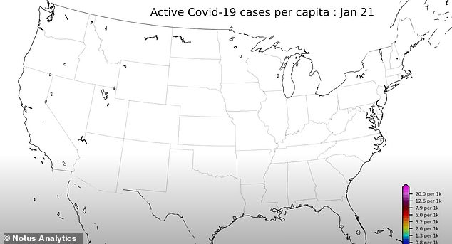
Notus Analytics has created an animated heat map detailing how COVID-19 spread across the U.S., beginning on January 21, 2020, when the first COVID-19 patient in the U.S. was identified in Washington state

Next, the map shows how corners of the country, such as New York and New Orleans, Louisiana, became hotspots in spring 2020
The animation begins on January 21, 2020, which is when the first American patient was identified to have contracted COVID-19.
‘Patient Zero’ was revealed to be a male resident of the U.S. in his 30s, who was treated at Providence Regional Medical Center – Everett, just north of Seattle.
He had traveled from Wuhan, China, where the virus originated, but did not visit any of the markets at the epicenter of the outbreak, according to state health officials.
Although it’s believed that that virus was circulating in the U.S. before this date, there were no commercially available tests for Americans to take to determine if they had the virus.
The map then continues into late March and early April 2020, when New York and New Orleans became two of the earliest epicenters.
New York was one of the only states where flights from abroad were landing when the U.S. called on citizens to return home.
The combination of so many international flights and people living in close quarters in New York City likely led to a surge in cases.
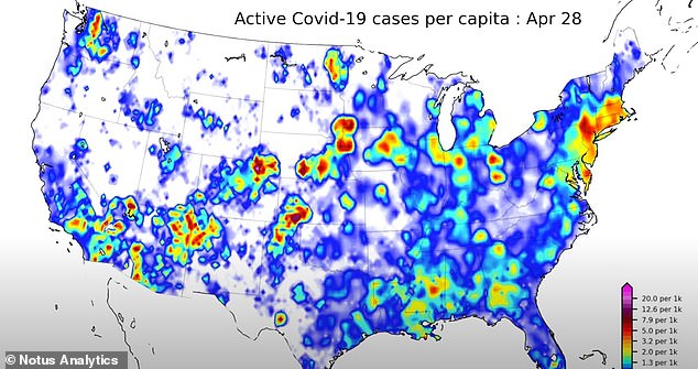
New York became a hotspot due to a large number of international flights and people living in close quarters while Mardi Gras in New Orleans was one of the first super-spreader events
In mid-April, the Big Apple saw as many as 800 people dying daily of COVID-19 and body bags piling up on the streets.
Meanwhile, Mardi Gras 2020 in New Orleans at the end of February made the state one of the earliest U.S. pandemic hotspots.
One study suggests a single person likely brought the virus to the Big Easy in the weeks before Fat Tuesday.
Researchers suspect that the patient infected 800 people within the two weeks separating February 13, 2020 and the conclusion of the festivities on Ash Wednesday, February 26.
They believe that those 800 then went on to spread the infection to another 50,000 people in Louisiana and neighboring states.
The animation continues and shows the second wave of the pandemic during summer 2020 that led to spikes in cases in the South and the West.
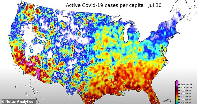
The Sun Belt and western states, including California and Arizona, were the hardest hit during the summer 2020 surge
On July 3, four states – Arizona, California, Florida and Texas – reported a combined 25,000 new COVID-19 cases, making them responsible for about 50 percent of all confirmed infections.
The map shows Gulf States colored in orange and red, indicating a high number of cases, and areas in Arizona colored purple, meaning that more than one in 50 people were testing positive every day.
At the time in Arizona, more than 3,000 people were hospitalized and ICU capacity reached 91 percent.
Officials revealed that if hospitals pushed past capacity, patients would be given a score to determine whether or not they’re placed on a ventilator.
Cases declined again in late August and early September, only to begin rising again in early November, the map shows.
This time, the surge was concentrated in the Midwest and Great Plains with states such as Illinois and North Dakota reporting all-time highs of infections.
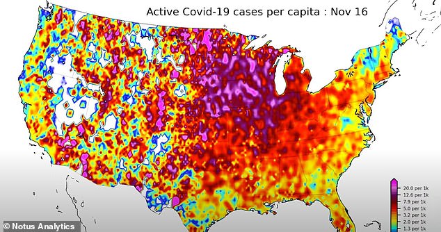
Between November 2020 and January 2021, most the map is covered in swaths of red and purple, indicating up to 20 per 1,000 testing positive
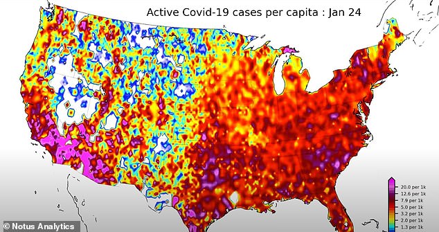
It was during this surge that the U.S. recorded its highest number of cases in one day (283,204 on January 8) and its highest number of deaths (5,443 on February 12)
In November, Department of Health and Human Services data showed that coronavirus patients occupied the greatest percentage of hospital beds in North and South Dakota out of all 50 states – with North Dakota reporting at one time that its hospitals had reached 100 percent capacity.
By December 2020 and January 2021, internal federal government maps showed that nearly the entire U.S. as one giant coronavirus hotspot.
The animation shows a similar situation with the Northeast, Southeast, Midwest, Southwest and West colored red or dark red, indicating that counties were reporting between five and eight cases per 1,000 residents.
In some pockets, as many as 10 per 1,000 were infected.
It was during this period that the U.S. recorded its highest number of cases in one day (283,204 on January 8) and its highest number of deaths (5,443 on February 12).
However, cases then began to decline in March and, by early June, most of the country is colored light blue, meaning most counties are reporting between 0.6 and 1.3 cases per 1,000.
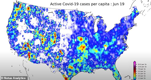
After cases declined in the spring, the map appears to mostly be colored blue, which indicates no more than 1.3 cases per 1,000 people
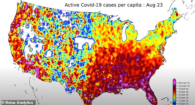
The animation ends on August 23, 2021, as the Southern U.S. reports record-high Covid cases and hospitalizations
During this time, the Indian ‘Delta’ variant was just starting to appear in the U.S. before it became the dominant strain.
Most cities and states lifted their pandemic-era restrictions including mask mandates and capacity limits.
Victory was short-lived, however, and cases began rising again. The map shows the progression of how the Southern U.S. became overwhelmed with cases up to Monday, August 23.
Unlike previous waves with large swaths of red and a few pockets of purple – indicating the worst surge – there are now several purple pockets.
States including Florida, Alabama, Louisiana and Texas have reported record-high cases and hospitalizations, and several say their hospitals and ICUs have reached capacity.
On Monday, the U.S. recorded 229,831 new cases and a seven-day rolling average of 150,098, which is a 161 percent increase from the 57,446 average seen four weeks prior.
The average is also the highest number reported since January 30, when the average sat at 150,960.
Officials also reported 908 virus-related fatalities with a seven-day rolling average of 1,011 – the third consecutive day that the average has topped four figures, which has not been seen since late March.
It also marks a 307 percent increase from the 248 average deaths reported 28 days ago.
Source link : https://www.dailymail.co.uk/health/article-9926653/Animated-heat-map-shows-progression-COVID-19-pandemic-US.html


