Most of us think about the ’90s with nostalgia and happy memories: lots of colors, awkward but fun technology that would make way too much noise. Dial-up internet… Movies like The Matrix, Star Wars, and Space Jam. Nirvana or Green Day blasting from a boom box.
The designers from Zyro decided they would bring us back and remake a few of the most popular websites these days. They took Facebook, YouTube, and a few more apps and put a ’90s twist on them. They even designed their floppy disks! So if you want to see what popular websites would have looked like in the ’90s, take a look!
More info: zyro.com | Facebook | twitter.com | Instagram | youtube.com
This post may include affiliate links.
YouTube
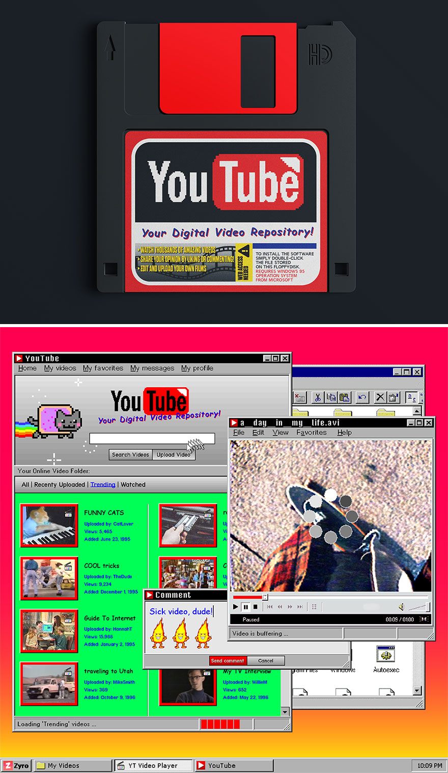
“Since YouTube debuted in 2005, it has become quite the Digital Video Repository. In the ‘90s, though, we imagine it would have been pretty basic: thousands (not millions) of videos to choose from, and of course, accessible via Floppy Disk.
As far as the videos themselves: what better to kill the hours in the ‘90s than watching rad skateboarding videos, people jamming out to cassette tapes in their cars, guides to The Internet, clowns (why so many clowns, ‘90s?), and of course, cat videos. Because those always work. Want to leave a comment? Just type it, and Send it in!”
Spotify
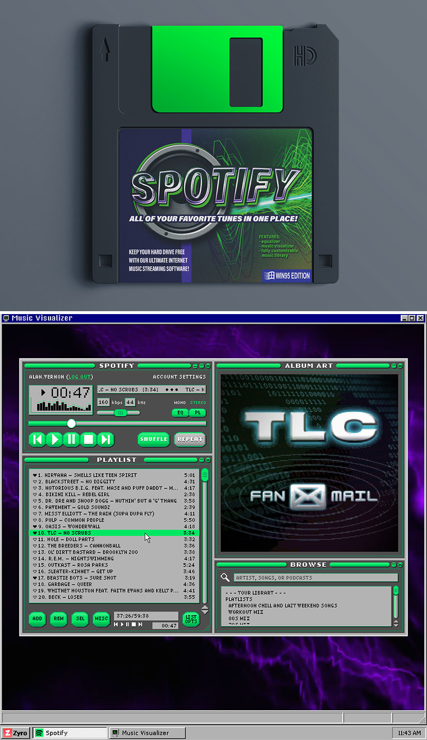
“Spotify came out in ‘06, but if it had come out just 10 years earlier, it would have come on this lime green floppy. Just like today, it would be all your favorite tunes in one place…
… But unlike today, all those tunes would probably be listed with no images, all caps, and your playlists would probably include a lot more TLC and Beastie Boys than they would today. Basically, you’d have a music player much like the old Winamp interface, with some top-of-the-line-psychedelia going on in the background. #So90s”
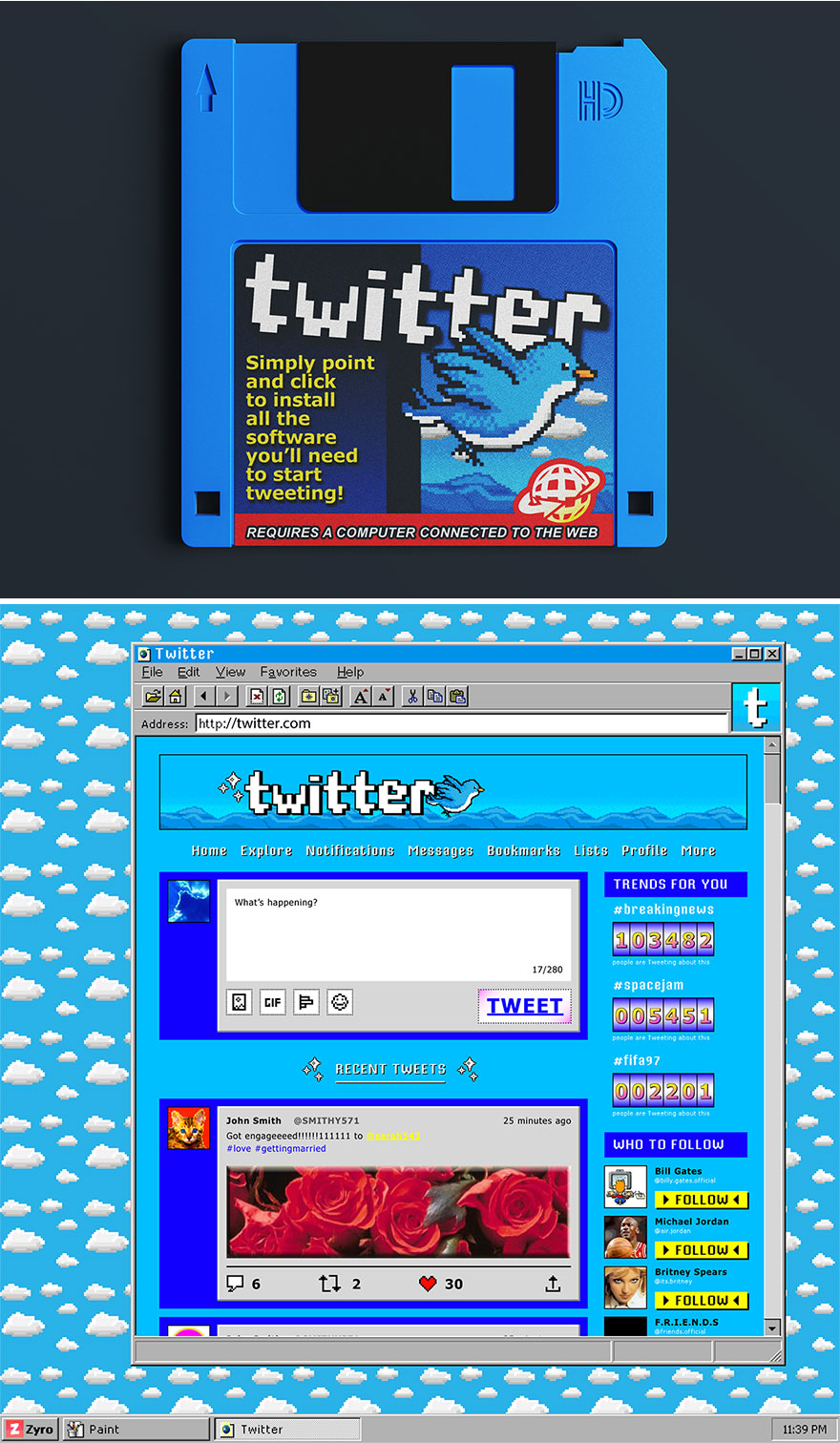
“Twitter was first introduced publicly in 2006. At the time, it had that early-aughts vibe: a cloudy, Mario 64-looking blue background, with a narrow block of text in the middle, and Twitter at the top in big bubble letters. But if it had been introduced even earlier?
We imagine it would look something like this. Of course, if it had been introduced in the ‘90s, there would have been plenty to Tweet about, just like today. From the serious (#LAriots) to the scandalous (#TeamMonica). Note: Must have a computer connected to the web!”
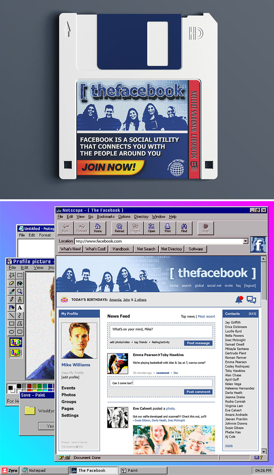
“Facebook: the social utilities of social utilities. Believe it or not, it has been around since 2004, and since then, has gone through as many makeovers as a ‘90s high school movie’s female lead. Here’s what we think it might look like if it had been released just a handful of years earlier.
Facebook: the social utilities of social utilities. Believe it or not, it has been around since 2004, and since then, has gone through as many makeovers as a ‘90s high school movie’s female lead. Here’s what we think it might look like if it had been released just a handful of years earlier.”
Twitch
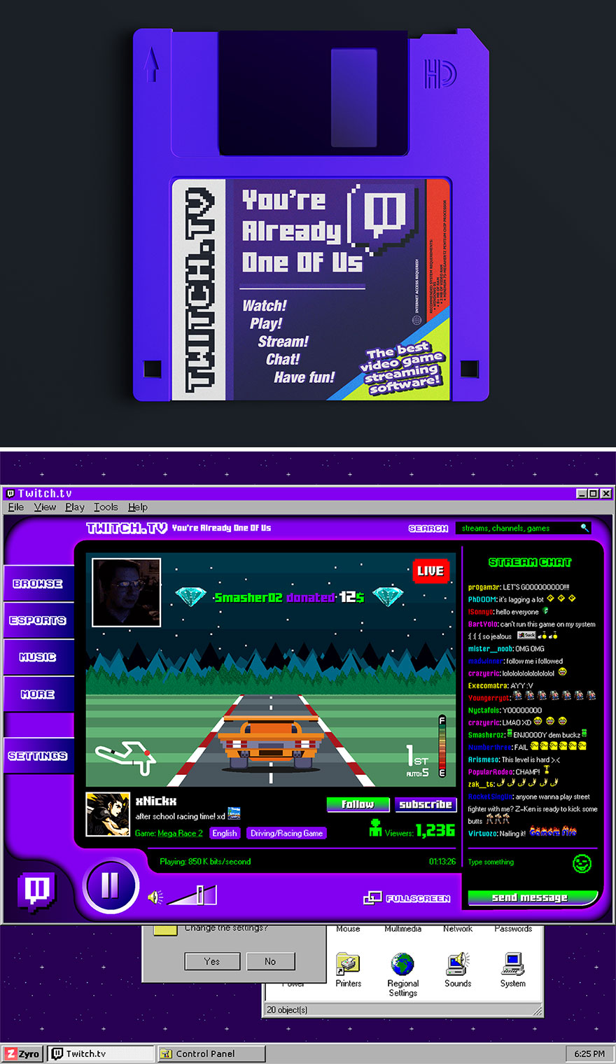
“Twitch isn’t all that old, debuting in 2011 and gaining popularity for its live streaming of video games. These days it’s all Fortnite and Minecraft and Counter-Strike. But back in the ‘90s? We imagine it would have been a lot different.
It would probably look a little something like this: a whole lot of flat, 2D-looking graphics and racing games. Lots of racing games. The chat would have been rainbow bright with a black backdrop, and poor xNickx’s video quality would be pretty grainy. But at least he’s killing it in the race!”
Airbnb
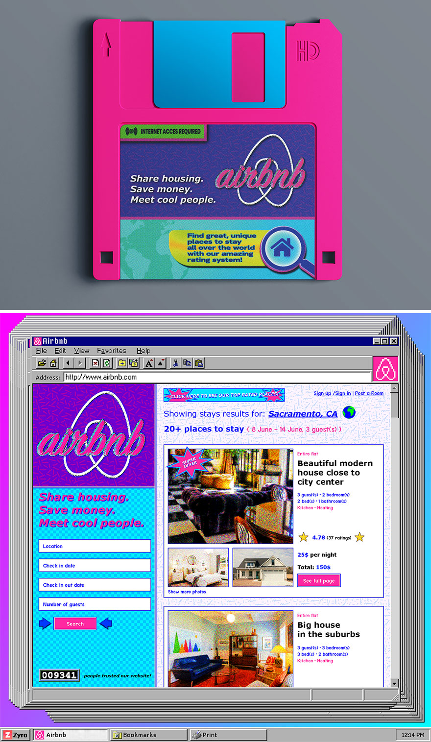
“When Airbnb first came out in ‘06, it was called AirBed & Breakfast, and it was all pinks and blues and purples. So when we reimagine what the ‘90s version would look like… Well, it’s very similar. #90scolors
In addition to having the color scheme of Barbie’s Dream House, we imagine the site would have some of those other classic ‘90s elements: all those blinking, rotating, or otherwise eye-catching graphics to let you know when there’s a Super Offer! coming your way, or of course, how many people have trusted the website. The houses themselves would look a little different (hello, primary colors!), and – does that say $25 per night?”
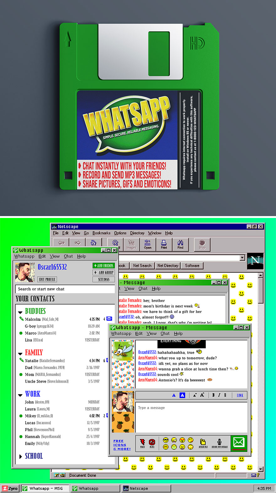
“WhatsApp would certainly look like the Warhead candy of floppy disks, with its classic lime green and yellow interface. Back then we wouldn’t exactly have had smartphones to video chat or send selfies (how do you even Selfie in the ‘90s…?), but take a chill pill: with ‘90s WhatsApp, you could still record and send MP3 Messages and share photos, gifs, and emoticons!
As far as the chat itself: we think it would have looked a lot like AIM. You’d be able to Warn or Block your friend, change up your font and color, and even send hyperlinks. There’s a 99 percent chance you’d have a cartoon profile avatar rather than your own photo, and of course, your screen name would probably be followed by some odd combination of numbers. Duh.”
Disney+
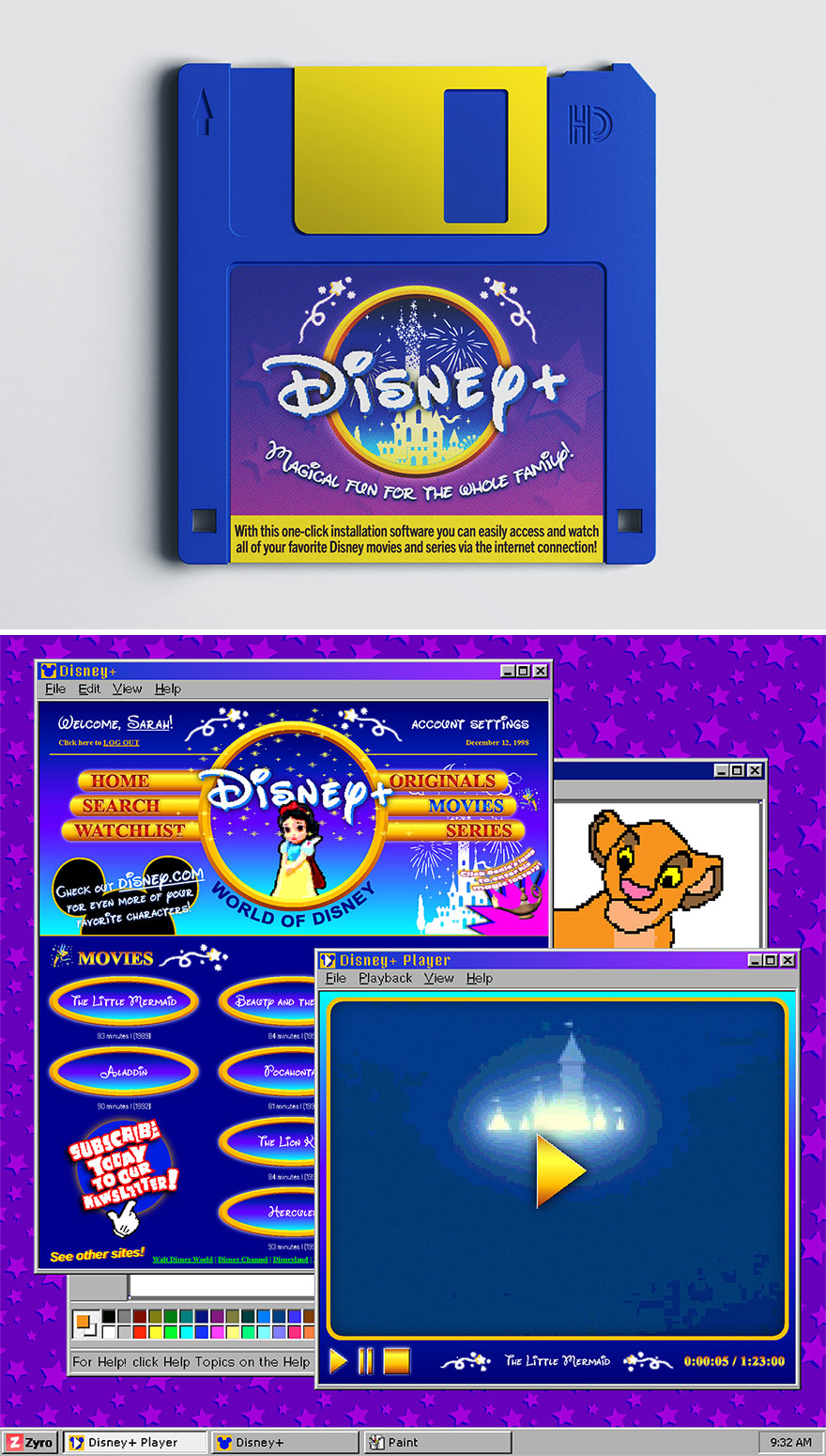
“Disney+ is certainly the newest kid on this block, debuting just two years ago in real life. But if it had come out in the ‘90s, it would have been the most coveted floppy disk in elementary school, next to Kid Pix. I mean, just imagine being able to watch all of Disney via your Internet Connection! (Bye, VHS!)
As far as design goes, we know it would be all blues, bubbly and rounded lettering, and that classic Disney gold. Just looking at this feels like being home sick from school watching Lion King. Fun fact: Did you know that the years between ‘89 and ‘99 were known as the Disney Renaissance?”
Source link : https://www.boredpanda.com/popular-website-remade-90s-style-zyro

