Creating a company logo is a fine art in and of itself. Just imagine: trying to generate something that should represent a company’s entire history and personality—which would translate into thousands of pages in length—but it should also be able to fit on a single business card. It’s like shoving 9 gigabytes worth of memes onto a single 3.5 inch floppy disk. It’s ridiculously hard, so getting creative is key.
Well, designer and TikToker Emily Zugay has been getting super creative in redesigning famous logos… with a twist… that twist being “improving” upon said logos in ways that make them… well… definitely something, all right!
Emily’s redesigns have been going quite viral lately, so we’ve compiled a list of her redesigned logos below. And while you’re down there, why not vote and comment on the ones you liked the most!
More Info: TikTok | Instagram
This post may include affiliate links.
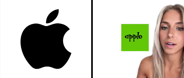
“The last victim was Apple. I hate this logo. There’s no symmetry going on. There’s not even any words indicating which brand this is. You just have to guess, so I don’t like that. This is my redesign of Apple’s logo. I thought they needed a type that was fun and appealed to the youth, like me, and I enjoyed it a lot. I also did start to miss the block from H&R block so I reincorporated it into this logo.”
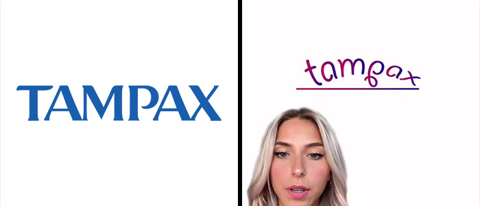
“Next, we have Tampax. An awful logo, but we really need a stronger one, especially for competing with Trojan and Magnum. With that being said, I chose a stronger, more masculine font to fit my vision. And I also added a line underneath it.”
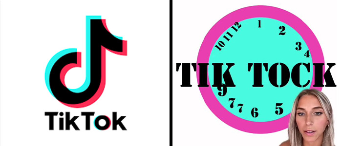
“The second contestant is Tik Tok. Nothing about this logo resembles time or a clock. This is my redesigned logo of TikTok, I kept the same colors because they were okay. And then I chose this font because it reminds me of cops.”
So, Emily Zugay is a designer and an established TikToker from Michigan who posts a variety of content. Fairly recently, she started a series of videos that introduce her revamps of famous company logos that I’d say are a sure improvement on their previous counterparts.
Namely, she seemingly aims to break every possible logo design rule there is to create the most ridiculous logos out there. Bright neon colors? You got it! Sexy cursive font? Slap that on there! Overly-minimalist symbolism? It’s there and more, making for some entertaining results.
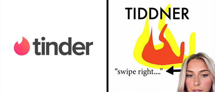
“The next victim is Tinder as a dating brand. I don’t know how I’m supposed to trust you because your whole logo is lowercase. And that doesn’t sound very confident to me. I capitalized the logo and then I included a tagline just so people understand how the app works. Swipe right.”
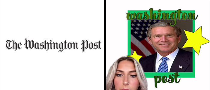
“The next brand who needed help was the Washington Post. Need I say more? So I added George W. Washington. We also added some props of color, some stars and a more fun font that appeals to a wider group of people. I couldn’t even read the previous one.”
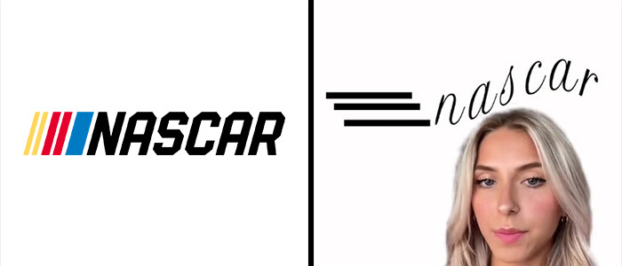
“First of all, starting with NASCAR, I don’t like this whole tilt that’s going on. And these lines are all very inconsistent. I just think, overall, it’s a really bad logo. This is my redesign. I wanted to make it look like the words were flying through the air at a very fast speed. This font overall is just more sophisticated as well.”
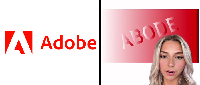
“Last and certainly, maybe certainly, least we have Adobe. I kept the red but chose a way nicer font. This is such a refreshing logo overall and I really think I blew it out of the park.”
The logos she has covered thus far are of brands known across the globe. These include Apple, NASA, Starbucks, Nascar, and a bunch of others.
Believe it or not, some of these companies have actually seen Emily’s designs and have proceeded to use them as their avatars. I kid you not, Emily has posted a video of seeing her logo being used by these companies’ official TikTok accounts.
Adobe also asked their logo to be improved. However, instead of using it as their profile pic, their sign at their headquarters has been vandalized with Emily’s redesign, as seen here. And that’s not all. Tinder, Tampax, Washington Post, among others have actually switched up their logos to these on TikTok! Talk about taking it to the next level.
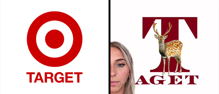
“First we have target, who doesn’t make any sense, it feels outdated and very childish to me. I wanted to draw inspiration from its predecessor, KMart, I love KMart, and I’m very upset that there’s no KMart anymore. So this is my version of Target’s new logo. I chose a darker tone of red because it’s a little bit more mature, and I chose a nicer font to elevate it. I included the deer because this made more sense to me than the circles.”
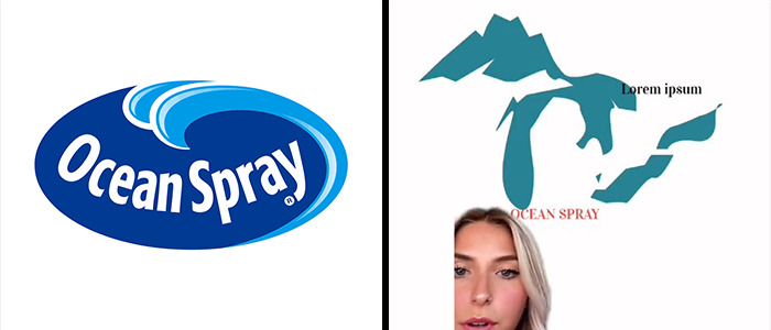
“Next was Ocean Spray, the juice company. There’s a rule in graphic design where you only need one blue and a logo. I don’t know why you have basically three. So I took a more artistic approach and have a solid color blue that contrasts with a nice orange.”
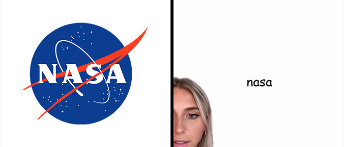
“Lastly, this is the most highly requested one. It’s NASA. I know that they have a lot to do with outer space and stars. I don’t like the colors. I don’t like the font. I don’t like anything about it. I don’t know why they tried to like include a bird to this doesn’t work for me. So this is my redesign of NASA’s logo. I chose Comic Sans because everybody knows that font and likes it a lot. When I was designing this logo, I really tried to keep it simple. So simplicity was what I was going for. And I think I did a really good job. Here’s a side by side comparison. So you can see how much of an improvement that mine is compared to whatever that is.”
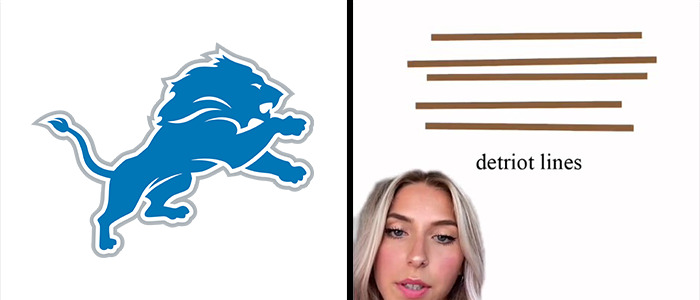
“Next I did Detroit’s football team the Lines and I don’t really understand your logo. It needed to be simplified quite a bit, sorry, just clean it up. And this will look a lot nicer on jerseys, helmets merchandise.”
Emily has had a pretty significant following on TikTok for a while now, currently standing at nearly 880,000 followers and a whopping 24.4 million views across her entire channel. However, these particular logo videos have been blowing up, garnering over 36 million views and 5.7 million likes across just three videos. Her videos also made some headlines in online news outlets.
Be sure to follow Emily on her TikTok and Instagram, and if you want more logo goodness, we have covered multiple artists who create logos for a living, like Gary Dimi Pohty and Sander Designs.
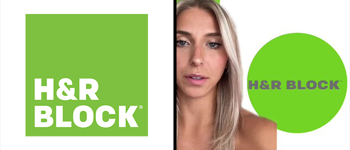
“Second contestant was H&r Block. I just hate the block. Now I put it in a circle instead.”
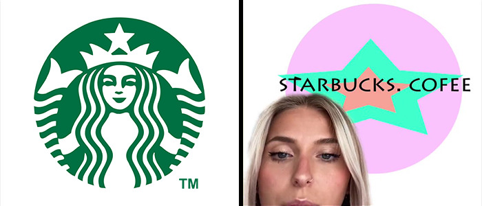
“The first logo I chose to work on was Starbucks. I don’t like anything about it. I hate this green color. I don’t like this figure. I don’t even know who that is. Maybe the president or something. The font is also just tacky and outdated. So I redesigned it with more of a happier feel. I wanted to maintain the integrity of the stars and the original logo because I truly think that’s the only good thing about it. And then I chose this nice contemporary font that pulls it all together.”
But before you go, why not let us know what you thought of these designs, and what logos would you want improved in the comment section below!
Source link : https://www.boredpanda.com/funny-logo-redesign-tiktok-emily-zugay/

